
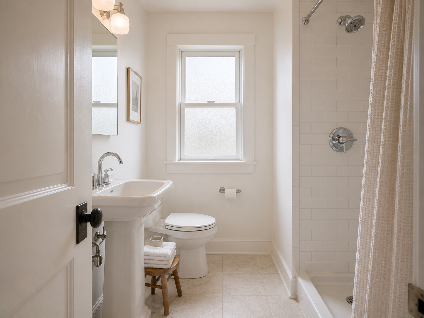
The quickest color fix for a small bathroom is to keep the walls, trim, and largest surfaces in the same light color family. That visual continuity reduces the hard breaks that make a tight room feel chopped up.
But “paint it white” is not the whole answer.
A small bathroom has several surfaces competing for attention: walls, tile, vanity, flooring, shower surround, hardware, and sometimes a very small window. The wrong combination makes those surfaces look like separate boxes. The right combination makes the room feel calmer and more open.
When choosing bathroom colors for small bathroom spaces, think beyond the paint swatch. Consider how the color behaves beside your tile, how much natural light enters the room, and whether you want the bathroom to feel warm, crisp, earthy, or dramatic.
Start With the Bathroom’s Natural Light
Look at the room during the morning, afternoon, and evening before choosing paint.
A bathroom with a north-facing window receives cooler, softer daylight. A warm beige that looks inviting in the store might appear dull or slightly gray in that room.
A bathroom with strong southern or western light has a different problem. Very warm colors can become surprisingly yellow once sunlight hits them.
Artificial lighting matters too.
A bathroom using a 2700K warm-white bulb will make cream, beige, and warm greige colors look richer. A cooler 4000K bulb gives whites and pale grays a crisper appearance.
Don’t choose the paint under the lighting in the hardware store.
Paint a large sample on two walls and check it at different times of day.
Soft White Is the Safest Starting Point
White works particularly well when the bathroom already has white fixtures and limited natural light.
But pure, brilliant white isn’t my first choice.
A slightly softened white creates less glare and gives the room more depth.
Benjamin Moore White Dove OC-17 is a reliable example. It has enough warmth to avoid the stark appearance of a bright builder-grade white while still looking clean beside white bathroom fixtures.
Another option is Sherwin-Williams Alabaster SW 7008, which has a warmer, softer appearance.
Use one of these across the walls and trim when you want the bathroom to feel visually continuous.
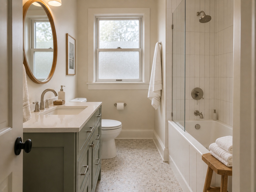
Pale Greige Adds Warmth Without Making the Room Heavy
Pure white isn’t your only option.
A pale greige works beautifully when you want some warmth but still want the bathroom to feel open.
The important word is pale.
Deep taupe or muddy beige can absorb too much visual attention in a tiny bathroom. A light greige keeps the room neutral while giving the walls more character.
Sherwin-Williams Agreeable Gray SW 7029 is a popular example, although the appearance changes considerably depending on the room’s lighting and surrounding finishes.
Pair it with white trim, a light vanity, and simple hardware rather than introducing several additional colors.
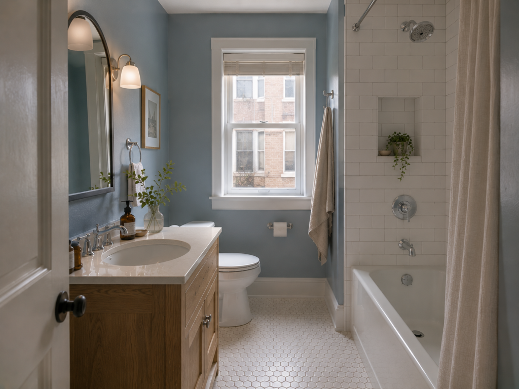
Pale Blue Makes a Small Bathroom Feel Fresh
Blue works particularly well in bathrooms because it naturally connects with the idea of water.
For a small room, skip the dark navy walls and look at dusty or muted blue instead.
A color such as Benjamin Moore Palladian Blue HC-144 gives you blue-green character without turning the bathroom into a brightly colored box.
Pair it with white tile, light wood, and brushed nickel or chrome fixtures.
The result feels fresh without relying on the predictable all-white bathroom.
Soft Green Works With Natural Materials
Green becomes especially attractive when the bathroom includes wood, stone, woven baskets, or plants.
A muted sage gives the walls some personality while remaining relatively easy to decorate around.
Look at colors such as Sherwin-Williams Evergreen Fog SW 9130 for inspiration.
I’d choose a muted green over a saturated emerald in a very small bathroom. Strong green walls become the first thing you notice, while a dusty sage lets the architecture and fixtures share the attention.
Warm Cream Is Excellent for an Older Home
Older homes often have warmer floors, wood trim, or vintage fixtures that don’t look right against icy white walls.
A creamy off-white bridges that gap.
Think about the bathroom as a whole rather than trying to make every surface bright white.
Cream walls with white tile, aged brass hardware, and warm wood can make a small bathroom feel established rather than newly renovated.
The trick is choosing a cream with enough depth to complement the existing finishes without becoming yellow.
Use One Color to Connect the Walls and Ceiling
Painting the ceiling white while using a completely different wall color creates a strong horizontal boundary.
That isn’t always a problem, but in a tiny bathroom it can visually divide the room.
Using a similar shade on the walls and ceiling creates a smoother transition.
You don’t have to use exactly the same paint color. A slightly lighter ceiling works too.
This approach is particularly effective in bathrooms with low ceilings.
Don’t Ignore the Tile Color
Paint isn’t operating alone.
A bathroom with beige floor tile, bright-white shower tile, and cool gray walls already contains three competing color temperatures.
Adding another accent color can make the room feel chaotic.
Instead, identify the dominant undertone in the existing tile.
Warm tile
Use cream, warm white, beige, muted green, or warm greige.
Cool tile
Use soft white, pale blue, blue-gray, or cooler neutral tones.
Patterned tile
Let the tile provide the visual interest and keep the wall color quieter.
This is one of the easiest ways to avoid a bathroom that feels busy.
Keep the Vanity Color in the Same Visual Family
A colored vanity can look fantastic in a small bathroom, but it shouldn’t fight the wall color.
A dusty blue vanity with soft white walls creates a gentle contrast.
A natural oak vanity adds warmth without introducing another strong color.
A black vanity creates a much stronger focal point and works better when the rest of the bathroom is restrained.
Don’t introduce a colorful vanity, patterned tile, colorful walls, and bold wallpaper all at once.
Something has to take a back seat.
The Mistake: Using Too Many “Light” Colors
This sounds strange, but a small bathroom can actually look busier with several pale colors.
Imagine:
- Cream walls
- Light gray floor
- Pale blue vanity
- White subway tile
- Beige countertop
- Warm brass fixtures
Every individual choice is light.
Together, they create a collection of competing undertones.
Pick a dominant color and one supporting color. Let the fixtures and materials provide the smaller accents.
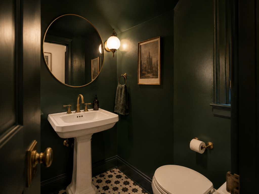
Should You Use Dark Colors in a Small Bathroom?
Yes — but deliberately.
A small powder room with no shower can handle a deep wall color beautifully because you aren’t trying to create a bright, spa-like space.
A dark green, charcoal, or navy can make the room feel intimate and dramatic.
The mistake is applying a dark color without considering the lighting.
A windowless 5 × 8-foot bathroom with a dark ceiling, dark floor, dark walls, and dark vanity will feel significantly heavier than one dark accent surface surrounded by lighter finishes.
Use contrast as a design decision, not as a desperate attempt to make the room interesting.
Colors I’d Avoid in a Tiny Bathroom
Not every color is automatically wrong, but these choices require more care.
Strong orange
Bright orange reflects heavily onto skin and bathroom surfaces, making the entire room feel warmer than intended.
Saturated yellow
A strong yellow becomes intense under artificial lighting, particularly in a windowless bathroom.
Very dark gray everywhere
Charcoal walls paired with a charcoal floor and black vanity can remove too much visual separation.
Multiple competing pastels
Pale pink, blue, green, and yellow might sound cheerful individually. Together they can make a small bathroom look like several design ideas were combined without a plan.
Icy blue-white
A very cold white beside cool gray tile and chrome can make the room feel sterile.
The issue isn’t simply the color. It’s the relationship between the color, lighting, tile, and fixtures.
A Simple Three-Color Formula
When you’re stuck, use this formula:
60% — dominant color
Walls, large tile, or major surfaces.
30% — supporting color
Vanity, flooring, or larger furniture-like elements.
10% — accent
Hardware, towels, artwork, or accessories.
For example:
- 60% soft white
- 30% natural oak
- 10% matte black
Or:
- 60% pale sage
- 30% white
- 10% aged brass
The exact percentages aren’t a renovation rule. They’re a useful way to stop adding colors randomly.
Test Paint Before Painting the Whole Bathroom
Don’t trust a tiny paint chip.
Buy a sample and paint it on a large piece of white poster board. Move it around the bathroom.
Look at it beside the vanity.
Look at it against the tile.
Check it with the bathroom lights on.
Then check it the next morning.
A color that looks perfect at 2 PM can look completely different under warm artificial lighting at 9 PM.
This small test costs very little compared with repainting the entire room.
How to Make the Color Work With Fixtures
Chrome, brushed nickel, matte black, brass, and bronze all change the way a wall color reads.
Warm paint colors pair naturally with brass and bronze.
Cooler whites and blue-gray shades work beautifully with chrome and brushed nickel.
Matte black is more flexible because it creates contrast rather than adding another strong undertone.
You don’t need to replace your fixtures just because you’ve chosen a new wall color. Work with what is already there.
FAQ
What bathroom paint finish should I use?
Choose a moisture-resistant interior paint designed for bathrooms, with a washable finish suitable for walls. Satin is a practical choice because it handles cleaning and moisture better than flat paint while producing less sheen than semi-gloss.
How long should bathroom paint dry before taking a shower?
Follow the specific paint manufacturer’s curing instructions rather than relying on a generic waiting period. Dry-to-touch time and full cure time are different, and humidity slows curing.
Can bathroom paint color affect how makeup looks?
Yes. Strongly colored walls reflect light onto your face and influence how skin tones appear in the mirror. A softer neutral around the mirror gives more predictable color than a highly saturated wall.
Should bathroom trim match the wall color?
It doesn’t have to. Matching trim and walls creates a continuous appearance, while contrasting white trim creates stronger architectural definition. In a very small bathroom, reducing strong visual boundaries gives you a simpler overall look.
Final Takeaway
The most common color mistake in a small bathroom is choosing paint before looking at the tile, flooring, vanity, and lighting.
Pick the existing finish that you cannot change, identify its undertone, and build the wall color around it.